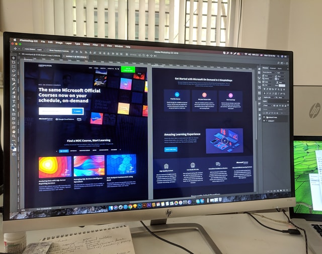
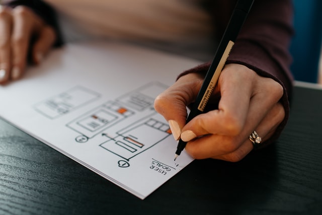
When you’re building a website, there are certain elements that can really make it standout from the crowd. These include things like great customer service and helpful customer support, but they also include things like overall design, user experience (UX), and even technical elements like load times. A lot of these elements have nothing to do with actual content or information — they’re purely design features that can make or break your website before anyone ever gets around to reading anything. Here are some common mistakes I see when looking at other websites:
Not optimized for mobile/responsive design
Responsive design is the practice of designing a website to be optimized for each individual device. Each device has a different screen size and resolution, making it necessary to optimize the content of your website for each one.
While desktop design is still important, mobile/responsive design has become so prevalent that it’s now more common for people to access websites via their smartphones than with their computers. Mobile devices are often used by people who are on-the-go so they will have longer sessions while browsing compared to those who sit at their desktops or laptops.
Having a responsive site not only improves load speeds but it also allows you as the designer more freedom in terms of what you can create because there will be no need to worry about creating multiple versions of your site based on screen size or platform (iOs vs Android).
Horribly broken mobile designs
Very often, we see websites that are simply scaled-down versions of their desktop counterparts. While this might work on a small screen size, it’s not the way to go for most users. Mobile design has some specific requirements and considerations you need to keep in mind when designing for phones and tablets.
No value in the pop-up
Pop-ups are a form of advertising and should be used sparingly in the design process. The only time you should use pop-ups is if they’re absolutely necessary for your site’s functionality, or when the information on your site is relevant to the content viewers had previously been viewing.
If you plan on using pop-ups on your website, make sure they fit within the context of that particular user session: if someone views a product page and then gets bombarded with an unrelated pop-up about another product, it’s going to be annoying for them!

Poorly cropped or resized images
If you want to use an image on your website, it’s important that the image is cropped and resized properly. Cropping refers to trimming off any excess white space around the edges of a photo. Resizing refers to reducing or increasing the size of an image without distorting its proportions. To make sure that your images are properly cropped and resized before using them in your website, check out our guide on how to crop and resize images. If you don’t have access to Photoshop or other tools for cropping and resizing images, try using one of these free online tools instead!
Auto-playing songs or audio
The necessity of auto-playing songs or audio depends on your particular website and your audience. If you’re running a music-based business website, then auto-playing songs or audio may be appropriate and even beneficial. But if you’re selling products online, it’s safer to avoid this element—especially if users aren’t familiar with your brand.
Auto-playing audio can be disruptive for visitors who have come to their site with the intention of learning more about what they offer, but end up being forced to listen to music instead. You should also take into account whether or not mobile visitors will be able to mute the sound if they so choose (this is often not an option).
Auto-playing videos
Auto-playing videos are a great way to catch your users’ attention, but they can also annoy and distract them. For example, if you’re showing a video that explains the value of your product or service, auto-play may not be the best idea because it doesn’t give visitors time to read through all the text on their own.
If you want your video to play automatically once users land on the page—or if you want to make sure it plays after a certain amount of time has passed—you’ll need to use JavaScript code for this functionality. However, many people use ad blockers which will prevent any type of JavaScript from loading in their browser so if this is true for your target audience then there’s little point in using this feature unless it’s vital for conversion rates (in which case we recommend paying off those pesky ad blockers).
If auto-play isn’t necessary for conversion rate optimization purposes then consider disabling it entirely by adding an HTML attribute called preload=”none” within a script tag with src pointing towards the webm file where everything else would normally go inside src=”
Text that’s too small or hard to read
If you want your visitors to read your content and stay on the site for longer, make sure that the text is easy to read. Be careful with font size and font color, because these two elements can make all the difference in how your website looks! If a visitor can’t read your content with ease, they won’t feel comfortable staying on your page. They might even leave without clicking through any of your links or reading anything else!
Here are some tips for making sure that people will be able to see what you have written:
- Make sure there is enough contrast between the colors used in both text and background colors. For example, if you are using black text on a white background (like most websites), try using something like blue instead of red so it stands out more against all white pages.* Don’t use too many different fonts; stick with one type throughout most parts of each page.* Keep things simple when choosing colors; dark green doesn’t go well with yellow orange but earthy tones like browns do.* Use proper spelling techniques (no abbreviations) so readers don’t get confused about what key words mean during their first few reads!
Splash pages
Splash pages are a big turn off. They waste your time and put you on a path to frustration that can be avoided. Splash pages are not necessary—for example, if your visitor has already visited the site before and is returning to it, he or she won’t need them.They’re also not effective; they don’t give you any information about what you’re going to see once you get past them (which means they might distract from the content ahead), and they can sometimes cause people who haven’t been there before to leave before getting anywhere at all (because they think it’s just another ad).
Instead of using splash pages, consider having what we call “a welcome page.” This is simply a short message that welcomes people back when they visit your website again after having left earlier in their visit—for example: “Welcome back! You’ve already added this item to your cart.” It won’t take much effort for you but will make an enormous difference in how visitors feel about their experience with your brand online
Infinite scroll
Infinite scroll is a user interface (UI) element that allows the user to continuously scroll through content without clicking on any links. Instead, the next set of results are loaded automatically when the bottom of the current page reaches it. This feature can be useful for some types of websites but in general isn’t recommended because it detracts from usability and creates unnecessary cognitive load for users.
To use infinite scroll correctly:
- Clearly communicate how many pages there are by showing an indicator or message at the bottom of each page.
- Use pagination if there’s more than five articles per page or if your site has more than eight levels deep.
Conclusion
We hope you’ve learned something from this list of common website design elements. If we’ve done our job correctly, then you should now know what not to do when designing a website! Remember that having a good user experience is key and will help your visitors engage with your brand more effectively. If you want to learn more about UX design for websites (and apps), check out some of our other blog posts on the subject here on our blog.
In concluding this blog post, let me remind you that as a business owner your job is to make sure your website does what it’s meant to do effectively. Don’t let some minor mistakes stop your site and your business from functioning optimally!
If you’re serious about getting your website professionally done, you’re better off hiring a graphic design freelancer to help you complete your website for your small business.

